The colors used throughout an office can influence productivity, employee comfort, focus, and even how clients perceive a business. Choosing the best office colors is about more than appearance. The right color palette can help create a more organized, energetic, and professional environment that supports daily operations. From corporate offices and commercial buildings to industrial workspaces, businesses throughout Braintree, MA and surrounding areas often rely on professional surface and coating solutions to create spaces that feel clean, modern, and built for long term performance.
In this guide, you’ll learn:
- Which office colors are trending for productivity in 2026
- How different colors impact focus and workplace mood
- The best color choices for various office environments
- Common mistakes businesses make when selecting office paint colors
- How professional painting improves long term appearance and durability
Best Office Colors to Maximize Productivity in 2026

Modern workplaces are evolving to prioritize productivity, collaboration, employee wellness, and professional presentation. Color selection plays a major role in shaping how employees feel and perform throughout the workday.
Businesses are increasingly using color strategically to improve focus, reduce visual fatigue, and create environments that reflect their company culture and brand identity.
- Improved Focus: Certain colors help minimize distractions and create calmer work environments.
- Better Productivity: Well balanced color palettes can improve concentration and workplace energy.
- Professional Appearance: Updated office colors create a cleaner and more modern first impression.
- Enhanced Employee Comfort: Comfortable color choices can reduce stress and visual fatigue.
- Long Term Durability: High quality commercial coatings help office spaces maintain their appearance longer.
Businesses throughout Braintree, MA and surrounding areas often update office interiors as part of larger facility improvement projects designed to improve workplace functionality and employee experience.
5 Best Office Color Ideas to Improve Productivity in 2026
Different office environments require different color strategies depending on how the space is used. Some colors encourage collaboration and creativity, while others help improve focus and reduce distractions.
The following office color ideas continue gaining popularity in 2026 because they balance aesthetics, professionalism, and functionality.
1. Soft Blue Tones for Focus and Concentration
Blue remains one of the most popular office colors because of its calming and productive qualities.
Soft blue tones help create an environment that feels focused without becoming visually overwhelming.
Benefits of blue office colors include:
- Reduced stress levels
- Improved concentration
- Calmer atmosphere
- Professional appearance
- Better visual comfort during long workdays
Blue tones work especially well in:
- Corporate offices
- Administrative spaces
- Conference rooms
- Financial offices
- Focus oriented workspaces
Lighter blue shades often pair well with neutral finishes to create a balanced and modern office design.
2. Warm Neutrals for Versatility
Neutral office colors continue trending because they provide flexibility and timeless appeal.
Warm neutrals create clean and welcoming environments while allowing furniture, branding, and architectural features to stand out.
Popular neutral tones include:
- Warm gray
- Beige
- Greige
- Off white
- Sand tones
Advantages of neutral office colors include:
- Long lasting style
- Easy coordination with branding
- Brighter workspaces
- Professional appearance
- Reduced visual clutter
Businesses throughout Braintree, MA and surrounding areas often choose neutral palettes because they remain versatile even as office layouts and furniture evolve over time.
3. Green Accents for Employee Wellness
Green tones are increasingly used in office spaces because they help create a calming and balanced atmosphere.
Green is commonly associated with:
- Focus
- Balance
- Creativity
- Wellness
- Reduced visual fatigue
Popular green applications include:
- Accent walls
- Collaboration spaces
- Break rooms
- Shared work areas
Muted sage and olive tones are especially popular in modern office design because they add warmth without feeling overpowering.
4. Crisp White for Clean and Modern Spaces
White remains a staple in commercial office design because it helps create a clean, open, and professional appearance.
Bright white finishes also improve light reflectivity, which can make offices feel larger and more energetic.
Benefits of white office colors include:
- Improved brightness
- Cleaner appearance
- Better light distribution
- Modern aesthetic
- Flexibility for future design updates
White works especially well when combined with accent colors or textured finishes to avoid overly sterile environments.
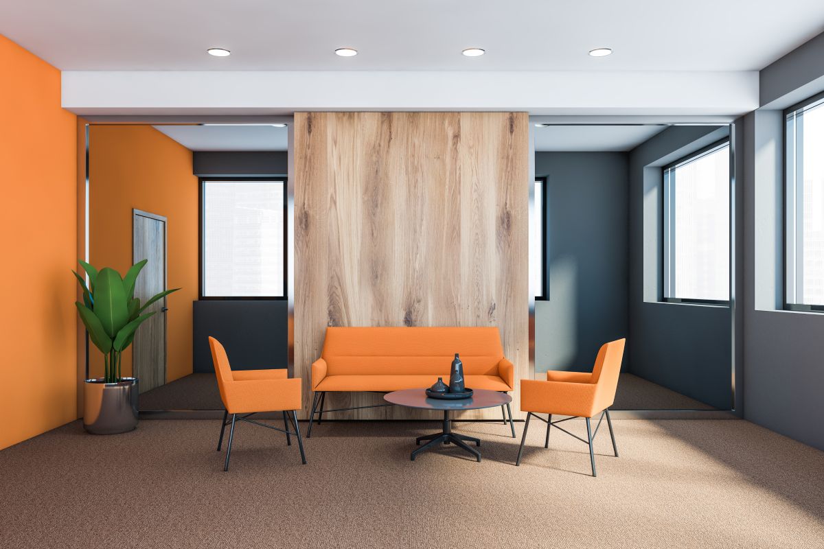
5. Charcoal and Dark Accent Colors for Contrast
While lighter colors dominate most office spaces, darker accent tones continue growing in popularity for modern commercial interiors.
Dark accent colors can help:
- Add visual depth
- Create contrast
- Highlight architectural features
- Improve branding consistency
- Add sophistication to meeting spaces
Common accent colors include:
- Charcoal gray
- Deep navy
- Matte black
- Dark forest green
These colors are often used strategically rather than throughout the entire office.
How Different Office Spaces Benefit From Different Colors

Not every office area serves the same purpose, which means color selection should vary depending on how the space is used.
Choosing colors based on functionality helps businesses create environments that support productivity and employee comfort.
Conference Rooms
Conference rooms benefit from colors that encourage focus and communication.
Popular choices include:
- Soft blue
- Warm gray
- Neutral beige
- Muted green accents
These tones help maintain professionalism while reducing visual distractions during meetings.
Collaborative Workspaces
Collaboration areas often benefit from slightly warmer and more energetic tones.
Good options include:
- Light green
- Warm neutrals
- Soft earth tones
- Accent feature walls
These spaces should feel inviting without becoming visually overwhelming.
Executive Offices
Executive offices typically prioritize professionalism and sophistication.
Common design approaches include:
- Rich neutral tones
- Charcoal accents
- Deep blue walls
- Warm wood inspired palettes
These colors help create polished and professional environments.
Break Rooms and Shared Spaces
Employee break areas can support comfort and relaxation through softer and more welcoming color choices.
Popular break room colors include:
- Sage green
- Soft blue
- Warm neutrals
- Light natural tones
Comfortable shared spaces often improve employee satisfaction and workplace morale.
Office Color Trends Businesses Are Following in 2026
Office design trends continue shifting toward environments that balance productivity, flexibility, and employee wellness.
The following color trends are becoming increasingly popular in commercial spaces throughout 2026.
Earth Inspired Color Palettes
Natural tones are gaining popularity because they create calmer and more grounded environments.
Trending earth inspired tones include:
- Clay colors
- Warm beige
- Olive green
- Sand tones
- Muted browns
These colors help offices feel more welcoming and less sterile.
Flexible Accent Color Design
Many businesses now use accent colors strategically instead of painting entire offices in bold shades.
Accent walls and color zoning help:
- Improve wayfinding
- Differentiate departments
- Reinforce branding
- Add visual interest
This approach creates balance without overwhelming the workspace.
Matte and Low Sheen Finishes
Matte finishes continue growing in popularity for office interiors because they create a softer and more modern appearance.
Low sheen finishes also help reduce glare and hide surface imperfections.
Brighter Open Workspaces
Open office environments increasingly prioritize brighter color schemes that improve visibility and create a more spacious feel.
Lighter color palettes can help:
- Improve natural light reflection
- Reduce visual fatigue
- Create cleaner looking spaces
- Support flexible office layouts
Facilities throughout Braintree, MA and surrounding areas often incorporate brighter finishes as part of larger office modernization projects.
Comparing Popular Office Color Choices

Different office colors create different workplace experiences depending on the environment and business goals.
The table below compares several common office color options and their benefits.
| Office Color | Best Used For | Main Benefit |
| Soft Blue | Focused workspaces | Encourages concentration and calmness |
| Warm Gray | Flexible office environments | Professional and versatile appearance |
| Sage Green | Collaborative areas | Supports balance and employee comfort |
| Bright White | Open office layouts | Improves brightness and modern appearance |
| Charcoal Accents | Executive and meeting spaces | Adds contrast and sophistication |
Choosing the right combination of colors helps businesses create spaces that support both productivity and long term design flexibility.
Common Office Color Mistakes to Avoid
Some office color choices can negatively impact comfort, focus, and long term appearance.
Common mistakes include:
- Overusing harsh bright colors
- Creating excessive visual contrast
- Choosing colors without considering lighting
- Ignoring long term maintenance needs
- Using trendy colors that age quickly
Professional planning helps businesses avoid costly repainting or design adjustments later.
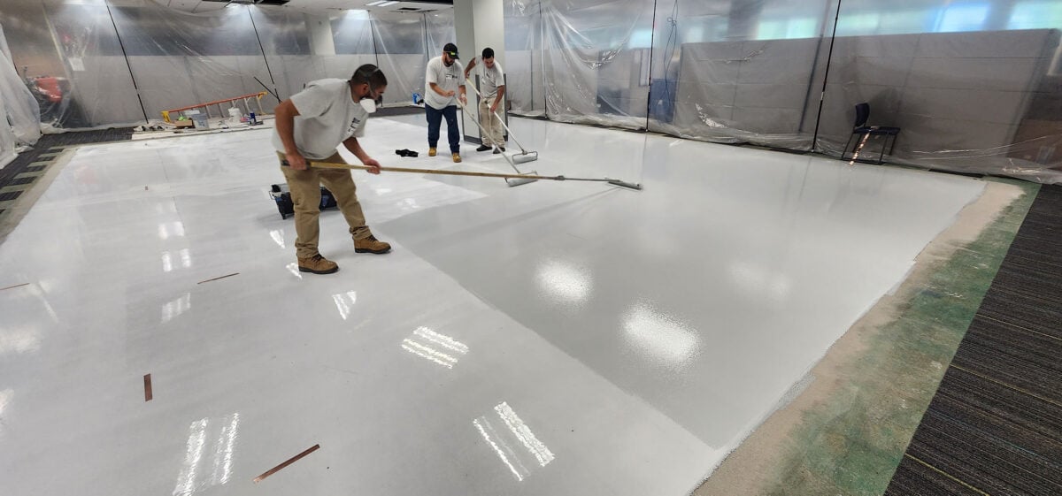
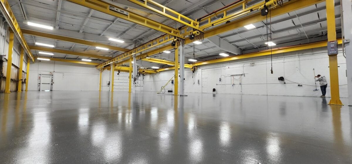
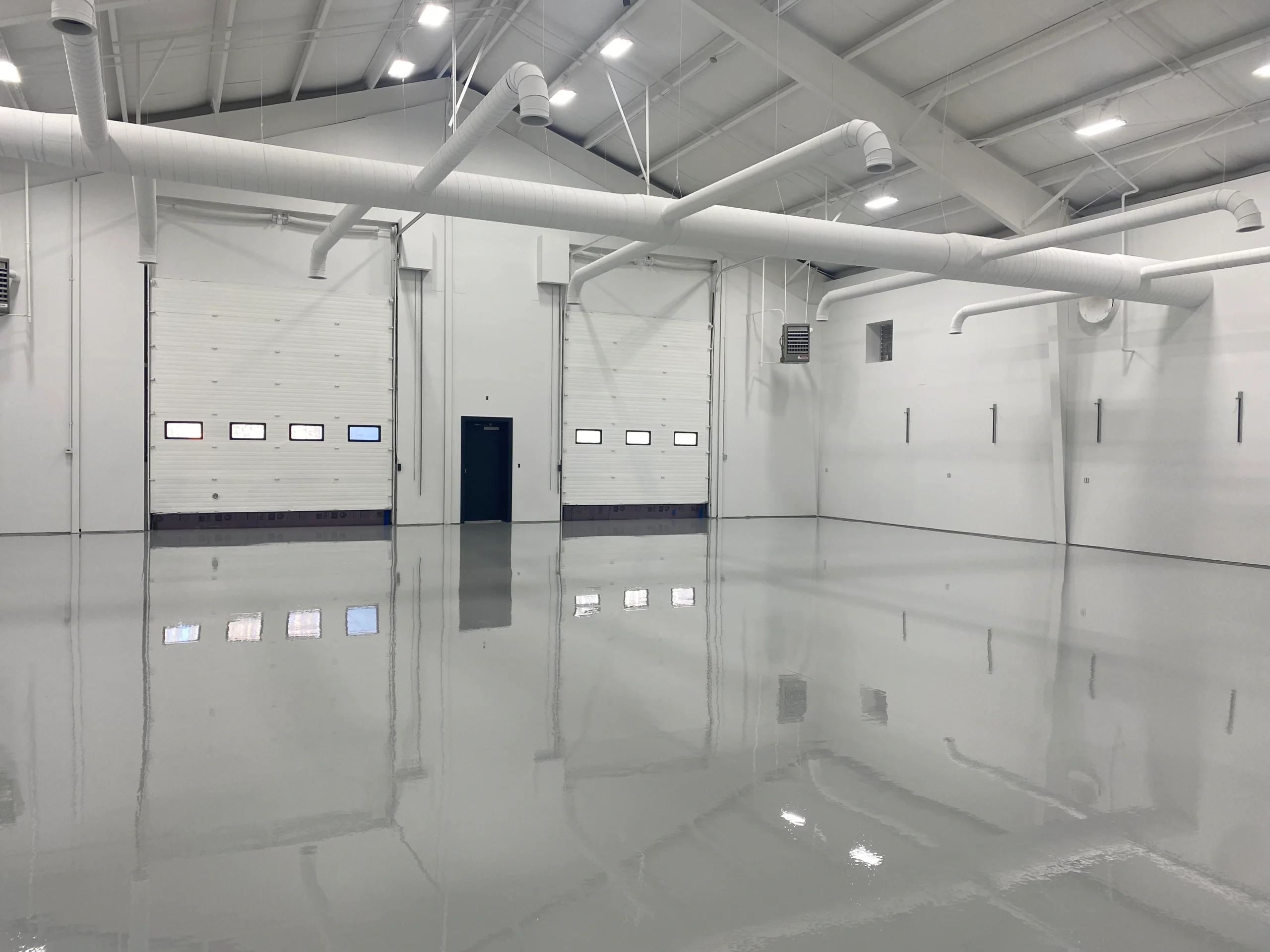
Why Professional Painting Matters for Commercial Offices
Even the best office color palette can look inconsistent if surfaces are not properly prepared and painted.
Professional commercial painting helps ensure:
- Smooth and even finishes
- Durable coating performance
- Proper surface preparation
- Consistent color application
- Long lasting appearance
Experienced painting contractors understand how to minimize disruptions while delivering durable and professional results.
Creating a More Productive and Professional Office Environment
Office colors directly influence how employees work, how customers perceive a business, and how comfortable a workspace feels over time. Choosing the right office color palette helps businesses create environments that improve focus, support productivity, and maintain a professional appearance.
McLean Company has been helping commercial and industrial clients throughout New England improve and protect their facilities since 1979 with dependable workmanship, responsive service, and high quality coating solutions designed for demanding environments. If your office space is ready for an updated look that supports productivity and long term durability, contact us today to discuss your project and learn how McLean Company can help transform your workspace.