

What are the best exterior paint colors for commercial buildings? There really is no single answer, but it is an important question to ask all the same. As painting professionals will surely attest, selecting paint colors for a commercial space that both appeal to consumer tastes and that capture the proper entrepreneurial mood can be challenging, but it’s a task well worth attention and consideration.
Choosing external commercial building colors will rely on any number of factors from the building’s architecture, to color symbolism and theory to the nature of the business that operates or will operate within its walls, just to name a few.
The Symbolism and Theory of Color
The symbolic and psychological effects of colors on those who view them need to be considered when planning commercial building color schemes. Colors can trigger reactions, emotions and even memories, so being aware of general rules regarding their application is the logical starting point of establishing commercial building color schemes.
Color Symbolism
Different colors mean different things among the various cultures of the world. When asked what a color like red symbolizes, the answer will be very different for someone from China than it will be for someone from a western country. This same process plays out with many colors, and it pays to understand how certain colors may be interpreted by the diverse people who may see it. Green can be associated with luck, finance or it can relate to nature and environmentalism. In America, white denotes purity and virtue, while in Japan, white is associated with death and mourning. Think about what your exterior paint colors might signify to your customers and clients.
Color Theory

Much like the symbolism or language of color, color theory will also play a big part in understanding colors that work well together and that won’t clash when used as part of commercial building paint combinations. Explaining color theory in depth is far too large an undertaking for a blog, but a quick primer on its most basic rules is certainly in order.
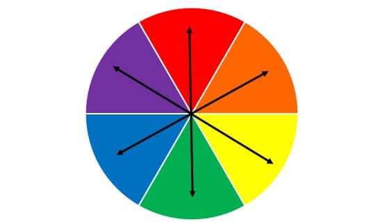
- Primary colors – are the colors red, blue and yellow. These colors are considered primary because they are colors that cannot be broken down into more basic colors. Any other hue will have varying amounts of these three colors mixed in to make them.
- Secondary colors – green, orange, and purple are considered secondary colors and are made by mixing various levels of our primary colors of red, blue, and yellow.
- Tertiary colors – yellow-orange, red-orange, red-purple, blue-purple, blue-green & yellow-green are made by mixing a primary color with a secondary color.
- Analogous colors – are groups of three colors that sit next to each other as one color becomes another. The grouping of blue, blue green, and green are an example of analogous colors.
- Complementary colors – when viewed on a color wheel, complementary colors are colors that are matched with colors directly opposite them. Red and green are considered complementary colors, and we see how well they work together every year around the end of December.
- Neutral colors – are not seen on a color wheel, but factor very heavily into any discussion about commercial building colors. Neutrals are created by mixing two complementary colors or by combining a given color with white, black or gray.
Creating Commercial Building Color Schemes
Armed with our new knowledge of the language and science of color, we can now begin to use this understanding to choose from the many different colors available and make pleasing color choices for the exterior of our commercial building.
Just understanding how color works is only part of what we must consider when selecting a choice of exterior color for a commercial building. We also have to consider the local environment surrounding the commercial structure location. The decision whether to blend in or stand out is important, since nothing will foster ill will towards a brand than installing a commercial building that clashes with and detracts from the beauty of landscaping and architecture in a given area.
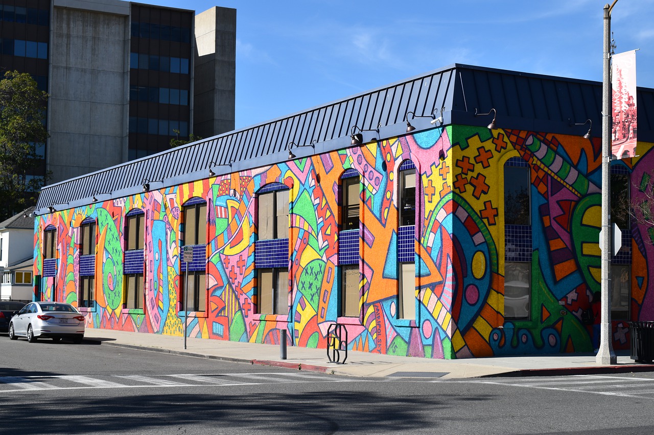
We should also consider what businesses and services will be conducted in the commercial space. Will it be office space, a warehouse, or a retail outlet? All three options require a different approach to color schemes. Warm, vibrant colors like orange, red, and yellow that build excitement about shopping are welcome for retail business exteriors, but would be considered far too garish for offices or warehouses. Conversely, the neutral grays and tans of professional warehouse and office exteriors would have a dampening effect on the moods of consumers who want to find the best and most exciting shopping deals available.
3 Choices for 3 Commercial Building Exteriors
Now that we have taken all factors into consideration and are ready to decide on commercial building paint combinations, we can narrow down choices based on what works with our brand or business model, the feelings we want to elicit from customers, and what’s appropriate for the surrounding area.
- For businesses and offices that are centered on innovation and commerce, primary colors like red and blue when splashed with bright eye-catching whites and grays will suggest a modern, cutting edge sensibility that will appeal to business partners and legal experts.
- A no-nonsense, bread and butter approach to commercial storage and other industrial spaces will yield muted grays and neutral tan colors broken up with dark, sensible hues like navy and burgundy that get across the uncomplicated and forthright nature of the business and help reassure potential customers that their stored products will be in good hands.
- Vivid greens and blues when paired with warm colors like yellows and oranges will give an energetic, vibrant impression to commercial exteriors that will draw customers and build enthusiasm about the products, goods and services just waiting to be discovered!
Accent with stark splashes of black and white to create an open market-like atmosphere even though the building itself may be brick and mortar.